ShopDreamUp AI ArtDreamUp

Deviation Actions


Suggested Deviants


Suggested Collections


![Flor de Saya [Manga]](https://images-wixmp-ed30a86b8c4ca887773594c2.wixmp.com/f/d5c844cc-3dd6-401c-864c-e9148134f64e/d9qipdo-f315b73d-3647-4686-a283-c27fa97e0744.png/v1/crop/w_184,h_184,x_0,y_19,scl_0.18253968253968,q_70,strp/flor_de_saya__manga__by_reinaanimeedition_d9qipdo-92s-2x.jpg?token=eyJ0eXAiOiJKV1QiLCJhbGciOiJIUzI1NiJ9.eyJzdWIiOiJ1cm46YXBwOjdlMGQxODg5ODIyNjQzNzNhNWYwZDQxNWVhMGQyNmUwIiwiaXNzIjoidXJuOmFwcDo3ZTBkMTg4OTgyMjY0MzczYTVmMGQ0MTVlYTBkMjZlMCIsIm9iaiI6W1t7ImhlaWdodCI6Ijw9MTQyNCIsInBhdGgiOiJcL2ZcL2Q1Yzg0NGNjLTNkZDYtNDAxYy04NjRjLWU5MTQ4MTM0ZjY0ZVwvZDlxaXBkby1mMzE1YjczZC0zNjQ3LTQ2ODYtYTI4My1jMjdmYTk3ZTA3NDQucG5nIiwid2lkdGgiOiI8PTEwMDgifV1dLCJhdWQiOlsidXJuOnNlcnZpY2U6aW1hZ2Uub3BlcmF0aW9ucyJdfQ.3M3wfTvr_cO0zQoqmS6ii5yRkBTU8x6ZradH2wj7K_Y)
![Flor de Saya [Manga]](https://images-wixmp-ed30a86b8c4ca887773594c2.wixmp.com/f/d5c844cc-3dd6-401c-864c-e9148134f64e/d9qipdo-f315b73d-3647-4686-a283-c27fa97e0744.png/v1/crop/w_92,h_92,x_0,y_9,scl_0.091269841269841,q_70,strp/flor_de_saya__manga__by_reinaanimeedition_d9qipdo-92s.jpg?token=eyJ0eXAiOiJKV1QiLCJhbGciOiJIUzI1NiJ9.eyJzdWIiOiJ1cm46YXBwOjdlMGQxODg5ODIyNjQzNzNhNWYwZDQxNWVhMGQyNmUwIiwiaXNzIjoidXJuOmFwcDo3ZTBkMTg4OTgyMjY0MzczYTVmMGQ0MTVlYTBkMjZlMCIsIm9iaiI6W1t7ImhlaWdodCI6Ijw9MTQyNCIsInBhdGgiOiJcL2ZcL2Q1Yzg0NGNjLTNkZDYtNDAxYy04NjRjLWU5MTQ4MTM0ZjY0ZVwvZDlxaXBkby1mMzE1YjczZC0zNjQ3LTQ2ODYtYTI4My1jMjdmYTk3ZTA3NDQucG5nIiwid2lkdGgiOiI8PTEwMDgifV1dLCJhdWQiOlsidXJuOnNlcnZpY2U6aW1hZ2Uub3BlcmF0aW9ucyJdfQ.3M3wfTvr_cO0zQoqmS6ii5yRkBTU8x6ZradH2wj7K_Y)


You Might Like…


Featured in Groups
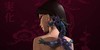
Description
For all of you people stalking me, throwing bricks through my windows, hunting me with whips and beating me because I haven't drawn an anime picture here yah go. . .
Just kidding. . .none of those things have happened. . .
I finally got some time to sit back and draw again! Yay! I'm so happy. It seems like forever since I've been able to draw. . .
Well anyways. . .here's to a new year in a few days!
I like how her hair turned out. . .
Enjoy!
Comments are welcome!
Image size
1425x2086px 1.41 MB
© 2007 - 2024 Deckboy
Comments84
Join the community to add your comment. Already a deviant? Log In
There is a lot of nice features to this image, her hair being the nicest in my opinion. I do however have a few issues with it. The first is the lack of value. You did such a nice job giving the hair those nice highlight and shadow areas that it really makes the parts that dont have that same amount of care stand out. Adding more definition with highlights and shadows to her shirt, skin, bow and flower would really make this image pop.
The second thing I notice is the inking. For the most part you do a good job varying the line weights, I still think you could push that further. Also I am wondering why you did not add an outline to her collar. The inking also seems a bit faded which might have something to do with your coloring technique. I get what your trying to do with the sorta fading effect with her body but in some areas it does not work. Like right beneath her left breast the green area goes right on the bottom of the page and makes an awkward tangent. Try making the green part go into a sort of softer gradient instead of just a jagged end. I also take issue with her left shoulder. I would have finished drawing out the shoulder completely and making it either go off the page completely or given it more room so it's not so close and making an almost tangent. Things like that really distract the viewers eye and detracts from the focus of your image.
Last issue I have is with the highlights on her hair, although nicely done, they are just too bright and draw the eye in an unfavorable manner, especially the large on at the top of her hair. It's a little too big and I would try maybe using a lighter shade of red or pink instead of straight white.
All in all it's a nice job just a few areas that hold it back and i think if you fix those or keep those in mind next time it will really make your work look awesome (Smile)")
The second thing I notice is the inking. For the most part you do a good job varying the line weights, I still think you could push that further. Also I am wondering why you did not add an outline to her collar. The inking also seems a bit faded which might have something to do with your coloring technique. I get what your trying to do with the sorta fading effect with her body but in some areas it does not work. Like right beneath her left breast the green area goes right on the bottom of the page and makes an awkward tangent. Try making the green part go into a sort of softer gradient instead of just a jagged end. I also take issue with her left shoulder. I would have finished drawing out the shoulder completely and making it either go off the page completely or given it more room so it's not so close and making an almost tangent. Things like that really distract the viewers eye and detracts from the focus of your image.
Last issue I have is with the highlights on her hair, although nicely done, they are just too bright and draw the eye in an unfavorable manner, especially the large on at the top of her hair. It's a little too big and I would try maybe using a lighter shade of red or pink instead of straight white.
All in all it's a nice job just a few areas that hold it back and i think if you fix those or keep those in mind next time it will really make your work look awesome